
Did you know that 85% of people say color is the primary reason they purchase a product or engage with a design? Now imagine that power in the context of your next event.
Color is not just decoration. It sets the mood, triggers memories, and even influences how long guests stay at your event. From a branding conference to a beach wedding, your palette speaks before you do.
As an event stylist who has worked across weddings, product launches, galas, and birthday bashes, I can tell you one thing with absolute confidence: choosing the right color palette can make—or break—your event.
So, if you’re wondering how to choose the right color palette for your next event, you’re in the right place. Let’s go beyond the basics and talk about mood, psychology, lighting, and more.
Also read: Top 7 Event Styling Trends for 2025
Understanding the Role of Color Psychology in Events
Ever walked into a space and instantly felt calm, excited, or focused—without knowing why? That’s color psychology at work.
- Blues and greens are calming
- Reds and oranges create energy and urgency
- Yellows can lift mood but also agitate in excess
- Neutrals feel clean and timeless
- Black and gold = luxury and glam
When choosing event colors, think about how you want your guests to feel—not just what looks pretty on Pinterest.
Color and Emotion Table (Quick Glance):
| Color | Feeling | Best For |
| Blue | Trust, calm, stability | Corporate events, wellness retreats |
| Red | Passion, energy, action | Product launches, parties |
| Green | Balance, nature, refresh | Outdoor weddings, eco-events |
| Gold | Luxury, elegance | Fundraisers, galas, upscale weddings |
So, before you choose your colors based on trends, ask yourself: What is the emotional message of my event?
Step 1: Define Your Event’s Purpose and Personality
Let’s start from the heart.
Is your event:
- Corporate or casual?
- Intimate or grand?
- Formal or playful?
I recently worked on a baby shower where the client said, “I want it to feel like a Sunday morning hug.” Instantly, I knew we were going with dusty pastels and soft textures.
If you’re launching a tech product, on the other hand, you might go with monochromes + a bold accent color to reflect innovation and confidence.
Tip:
Your primary color should reflect your event’s personality.
Your secondary color should add contrast or harmony.
Your accent color should pop or guide attention.
Step 2: Consider the Season and Setting
Yes, the venue and time of year matter—a lot. Colors react to surroundings. Here’s how I guide my clients:
Spring Events:
Soft pinks, lavender, mint, sky blue – think blooming and breezy.
Summer Events:
Coral, turquoise, lemon, fuchsia – vibrant, energetic, fun.
Fall Events:
Terracotta, burnt orange, forest green, burgundy – grounded and cozy.
Winter Events:
Navy, emerald, deep red, champagne – rich and luxurious.
Also, check your venue’s existing color tones. If the walls are deep red, your lavender-themed party may clash—visually and emotionally.
Step 3: Choose a Dominant Color + 2 Supporting Tones
A solid rule of thumb in modern event décor ideas is the 60-30-10 rule:
- 60% dominant color
- 30% secondary
- 10% accent
Here’s a real-life example from a wedding I styled:
- Dominant: Blush pink
- Secondary: Sage green
- Accent: Rose gold
It was romantic without being too sweet. Elegant without losing personality.
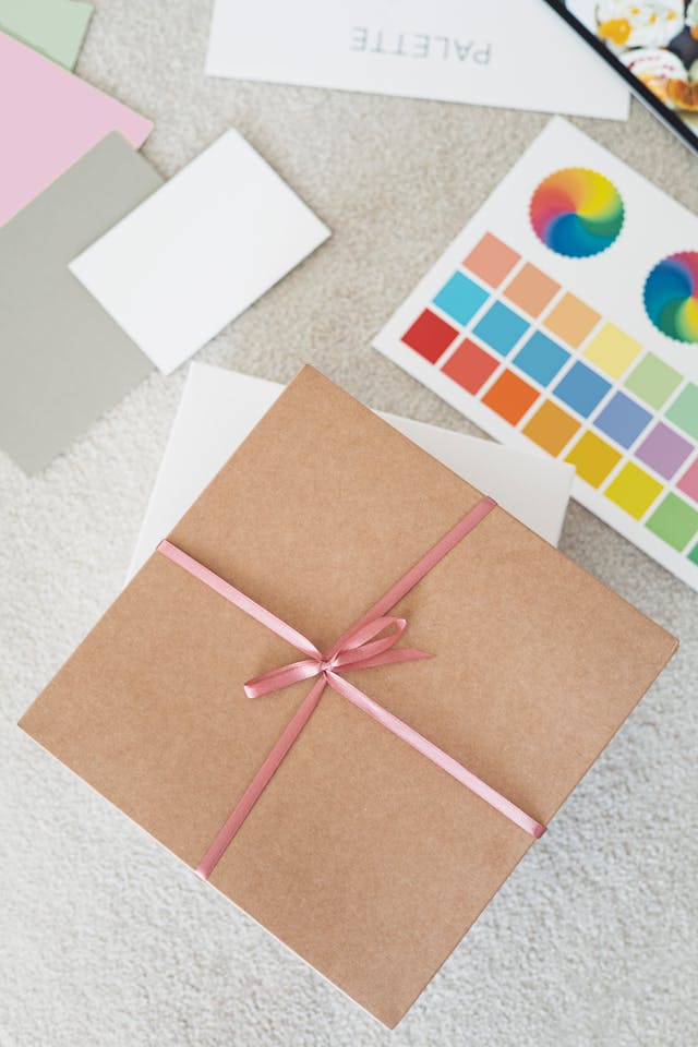
Tip:
Use color wheel tools like Adobe Color or Coolors to test harmony. Analogous (side-by-side colors) create soothing results. Complementary colors (opposites) create drama.
Step 4: Think Functionally (Lighting, Photography & Mood)
Color can look dramatically different depending on:
- Indoor vs. outdoor light
- Day vs. night
- Warm vs. cool lighting
One of my biggest lessons? What looks good on a mood board might not translate in real life.
Once, I designed an evening reception with navy and gold. Looked great under warm light. But in the photos? The navy looked almost black. Lesson learned: always test swatches in real light conditions.
Step 5: Match Your Palette with Event Elements
Once your colors are chosen, don’t just stick them on flowers and tablecloths. Apply them across:
- Signage
- Menus
- Lighting
- Dress code
- Cake & dessert displays
- Floral choices
- Table runners & chair drapes
This is how your event feels cohesive—and intentional.
And guess what? Guests feel the difference when every detail speaks the same color story.
Bonus: Color Trends for 2025
Need inspiration? Here’s what’s trending right now in wedding styling trends and corporate event themes:
- Muted metallics: Champagne, antique gold, and brushed silver
- Moody florals: Deep plum, rust, and mauve
- Earthy minimalism: Sand, terracotta, sage
- High contrast: Charcoal with peach, navy with coral
- Digital brights: Neon teal, cyber purple, and vivid coral for tech events
But remember, trends come and go—your story should stay center stage.
Real Client Stories (A Peek Behind My Palette)
Story 1: The Sunset Wedding
The bride said, “I want it to feel like we’re marrying under a desert sky.”
We used: terracotta, soft peach, dusty blue, and pale gold.
Outcome: The guests stayed till midnight, watching fairy lights reflect off warm-toned decor. Pure magic.
Story 2: The Corporate Innovation Event
Client brief: “It must look sleek, but not cold.”
We used: black, white, with pops of burnt orange and LED-blue.
Result? Modern, bold, and every guest selfie matched the brand color!
Common Mistakes to Avoid
- Choosing too many colors – Keep it to 3 core tones max.
- Ignoring the venue’s colors – Blend, don’t battle.
- Overlooking lighting impact – Test everything under real conditions.
- Forgetting the guests – Will they feel the atmosphere you’re creating?
Quick Tools You Can Use
- Canva’s Color Palette Generator – Upload an image and extract a palette
- Pantone’s Color Finder – For precision and print use
- Pinterest Boards – Curate and visualize combinations
- Swatch Testing – Test fabrics, florals, and print materials in natural light
My Personal Formula: Feel + Flow + Function
If you’re still unsure how to choose the right color palette for your next event, here’s my go-to formula:
- FEEL – What emotion should the space evoke?
- FLOW – How do colors guide movement and attention?
- FUNCTION – Will it photograph well and suit lighting/timing?
Color should never just “look nice.” It should feel right, serve a purpose, and tie everything together.
Final Word: Choosing the Right Color Palette Isn’t Just Design—It’s Experience
At the heart of it, your event is a story. And color is the first sentence guests read.
Whether you’re planning a wedding, launch party, or creative workshop, the right color palette will elevate every moment. It will create memories, set tone, and deepen impact.
So if you’re still wondering how to choose the right color palette for your next event, trust the feeling in your gut—and test it in real light!
Because in 2025, it’s not about trends—it’s about timeless emotion done thoughtfully. And that? Never goes out of style.